Alexis Hildahl
BRAND STRATEGY
IDENTITY DESIGN
PRINT COLLATERAL
WEBSITE
The Deeper Meaning
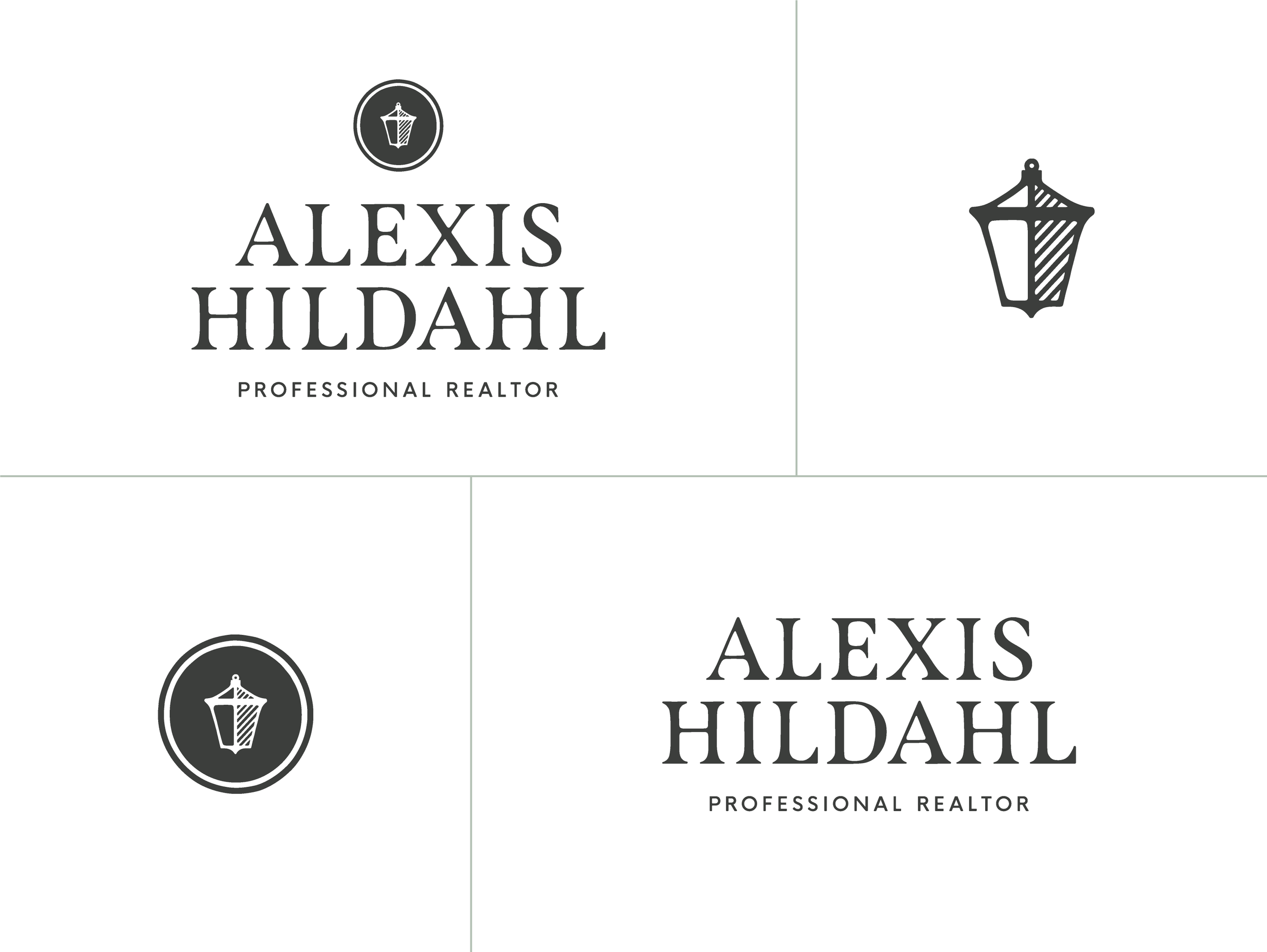
The classic nature of the Alexis Hildahl brand is designed to draw people in with its organic, strong, luxurious, yet accessible impression. The overall look demonstrates Alexis’ own passion for beautiful homes and quality designs while also appealing to a clientele that values their space and desires a next-level real estate experience. We recognized that people don’t just want a house — they want a home that feels like a retreat. That’s why the brand is grounded, welcoming, and thoughtfully illustrated by hand. Each person who interacts with the brand should immediately get the sense that they can relate to Alexis and trust her to guide them through the home buying or selling journey. From first impression onward, each touchpoint between the brand experience and in-person interactions with Alexis will be consistent, reliable, and full of excitement for the future!
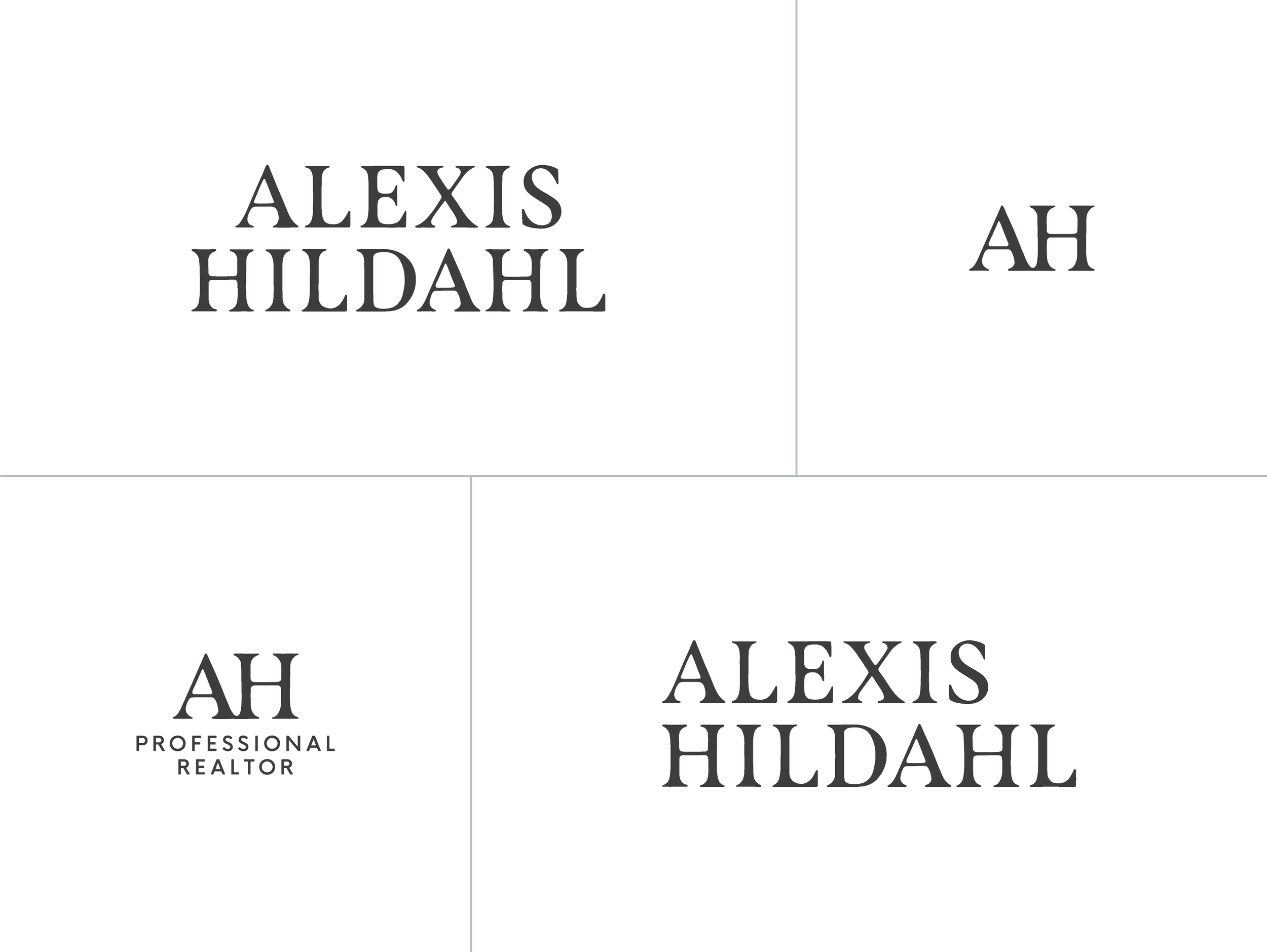
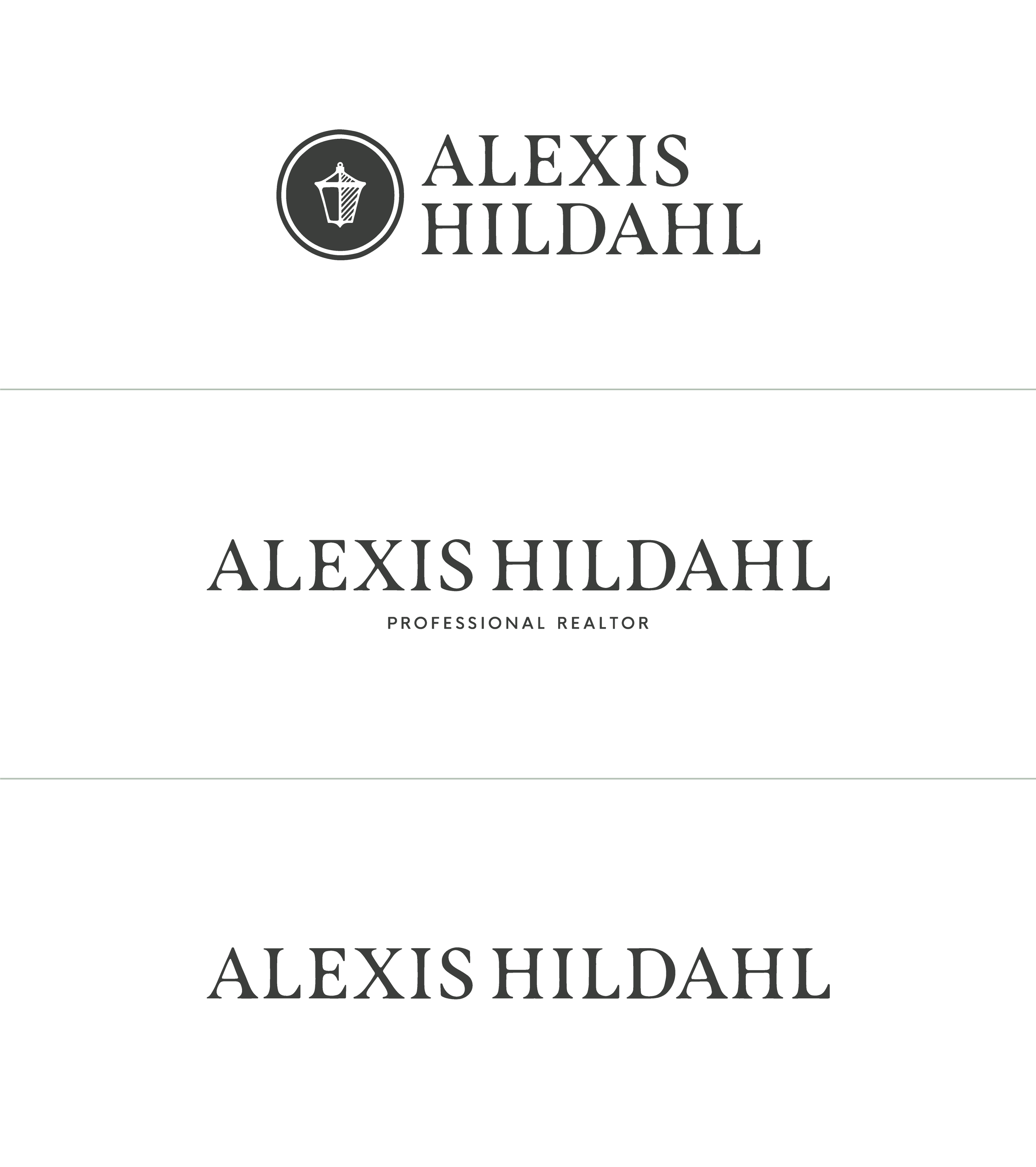
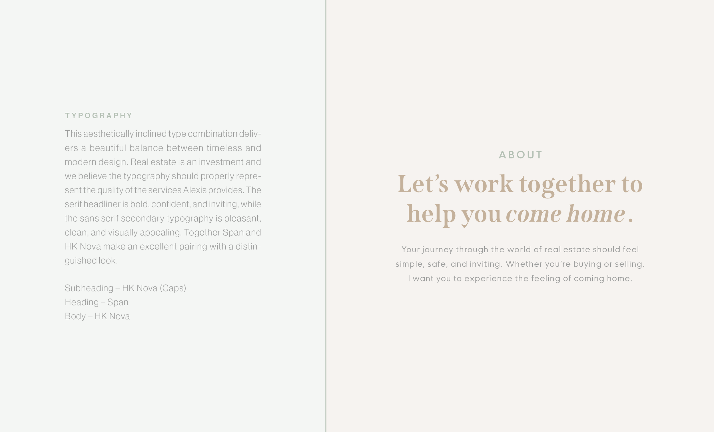
It became apparent early on in the process that a clean, professional uppercase serif was the best solution for the primary typeface. In order to give the brand a more custom, timely, and approachable feel, we digitally laid out the logo exactly how it needed to be rendered, then retraced the letterforms in ink before vectorizing and finalizing the details. The newly modified typography has a softer feel which allows the brand to stand apart — providing a sense of establishment to the viewer. Bringing unique characteristics to the brand builds trust, recognition, and notable differentiation factors that can’t be easily replicable.
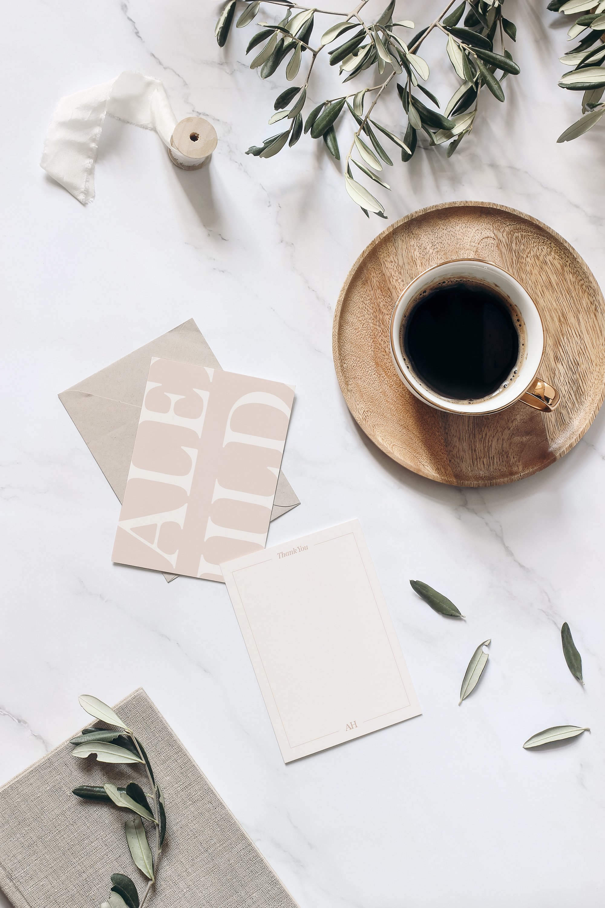
Because Alexis Hildahl Real Estate is family-oriented, we created a colour palette that strives to balance feminine tones with classy neutrals so the brand can appeal to a diverse audience. We included four primary colours along with two tints of each one for the secondary selection. Slate and Linen exist to communicate sophistication and luxury while Cambridge and Quartz bring that level of approachability for the modern family.

